2022
Chigasaki City Museum
Visual Identity
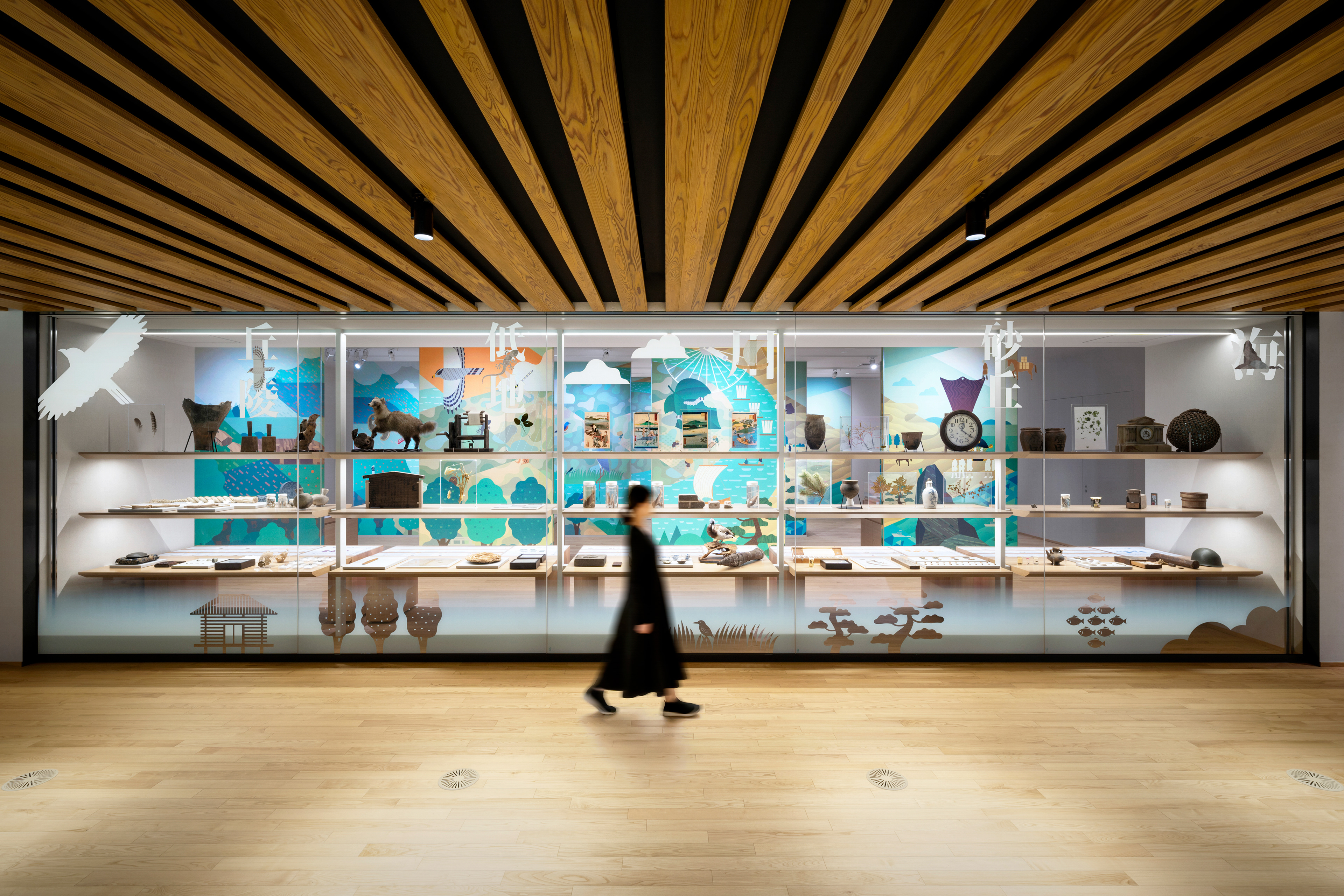
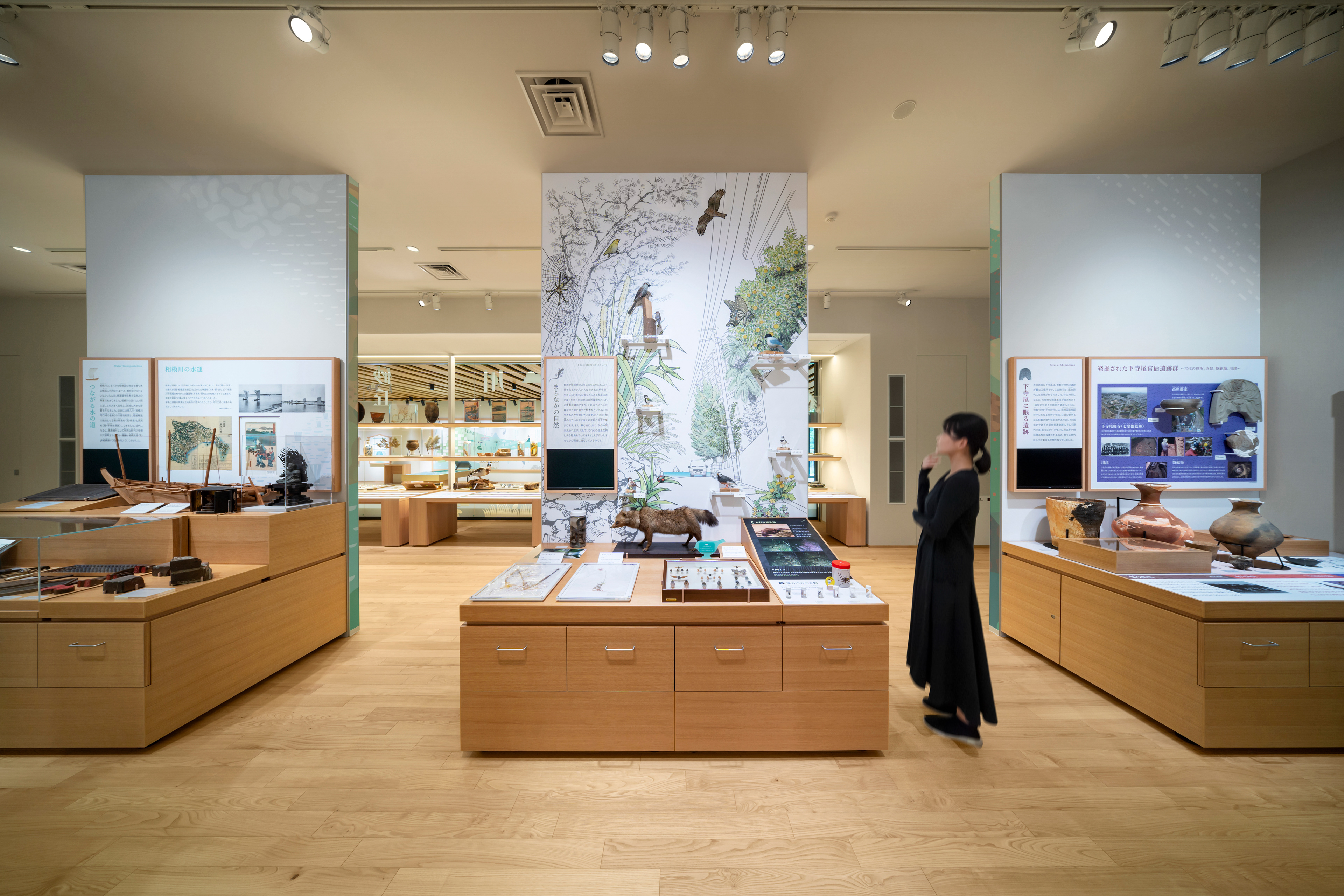
A museum that exhibits pieces which convey the nature and peoples’ lives in Chigasaki. The exhibitions consist of a total of 17 themes used in representing the five rich topographical features of Chigasaki: "sea", "sand dunes", "rivers", "lowlands", and "hills". By changing these themes’ pieces seasonally, visitors can make new discoveries every time they visit.
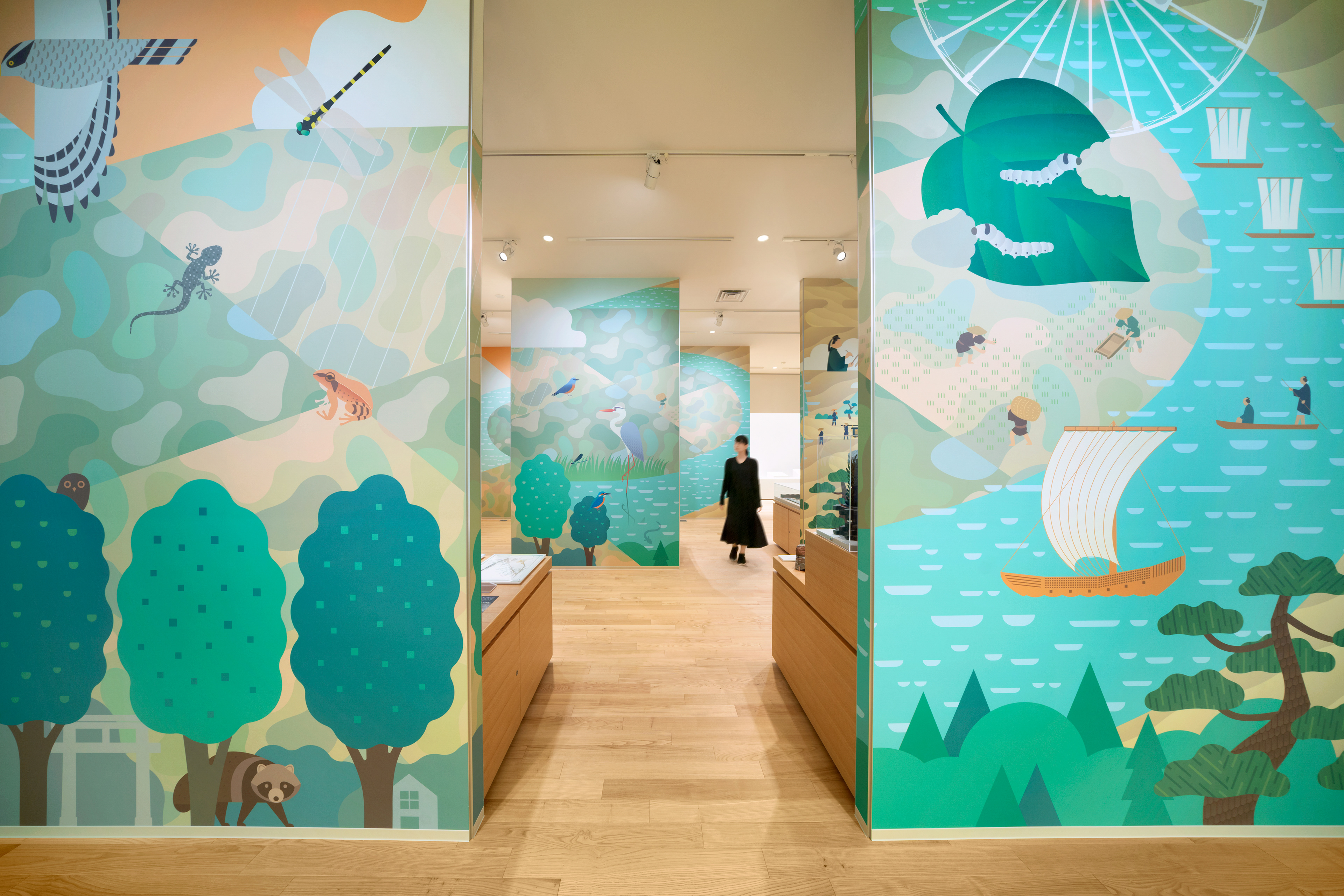
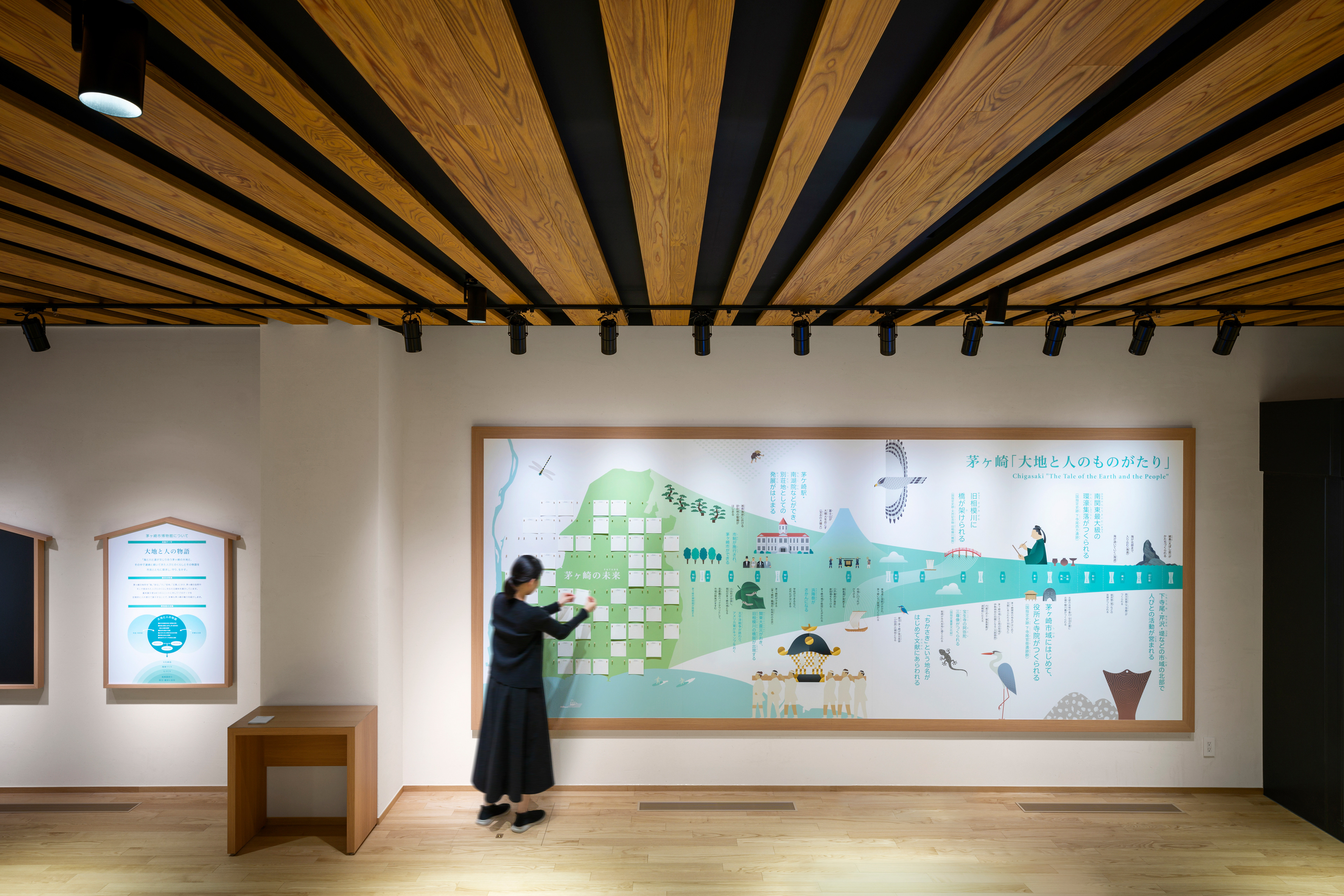
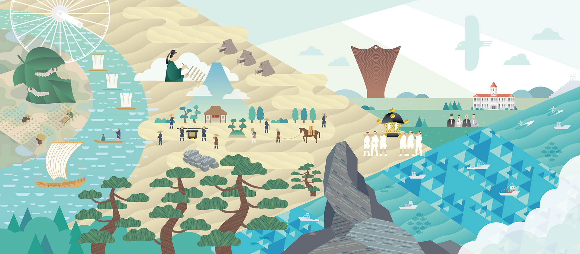
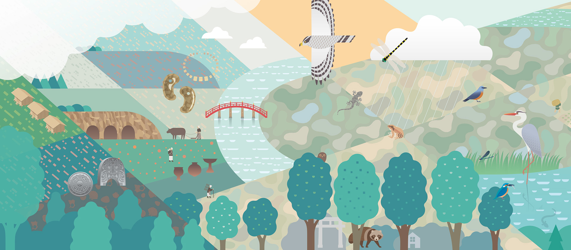
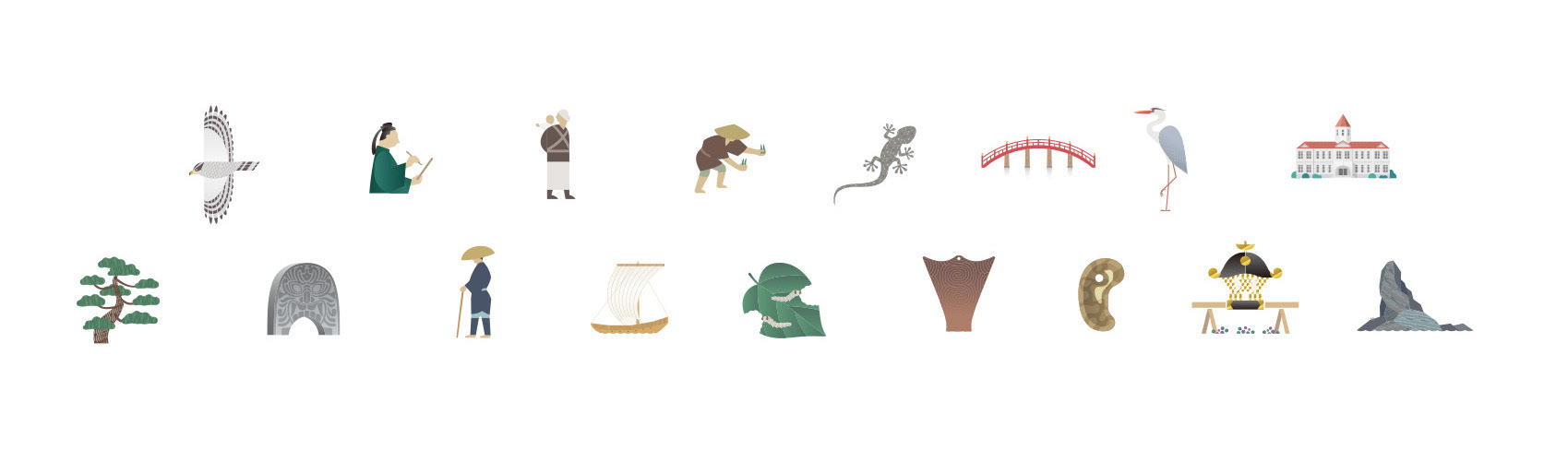
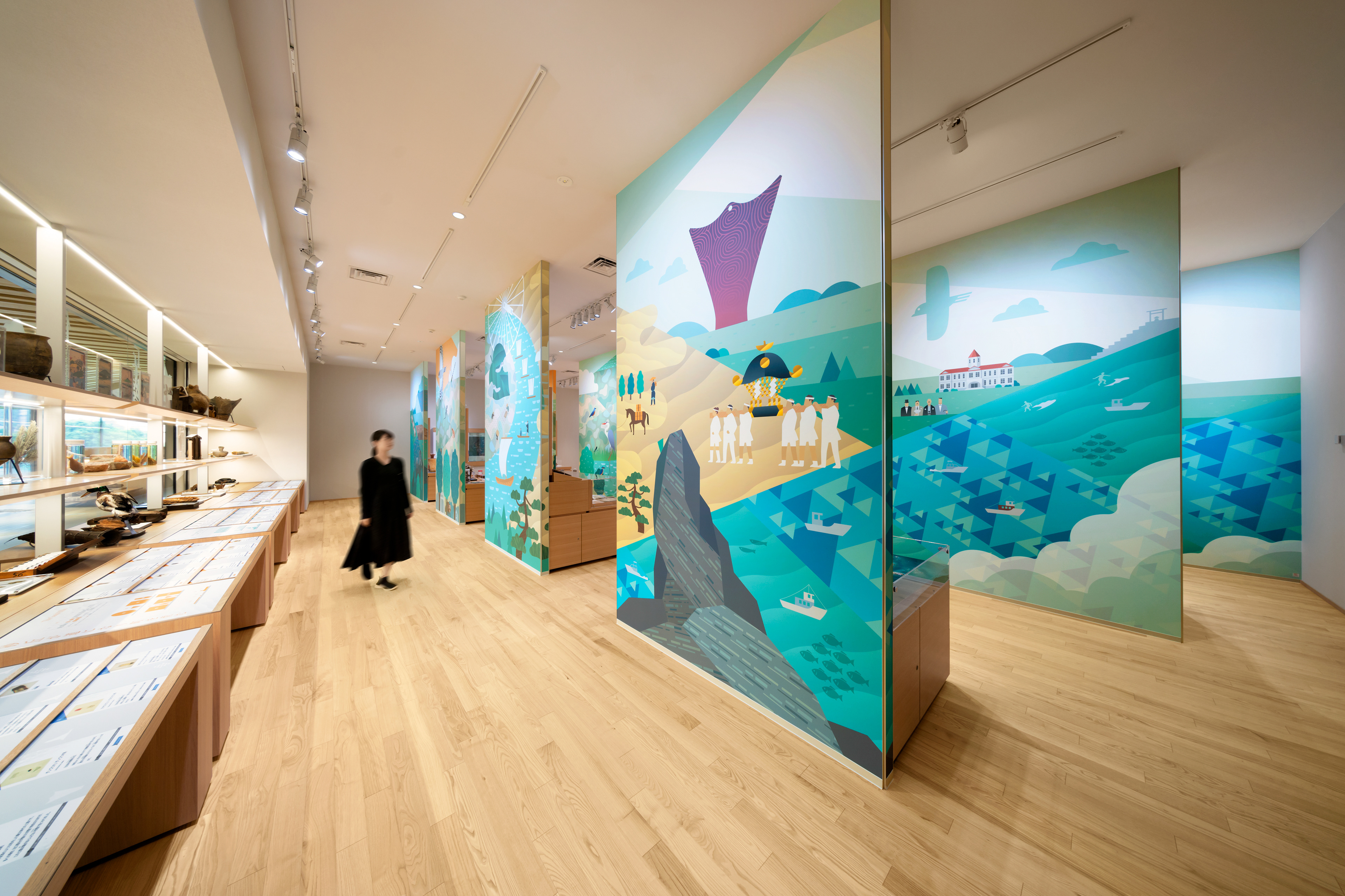
I created 17 icons to symbolize each of the 17 themes. These icons also serve as signage and play a role in the crossover of representing the pieces on display. This allows visitors to freely explore the room according to their interests and curiosity, regardless of the order. Furthermore, these icons are also used as part of each exhibit, such as the chronology, therefore organically connecting the entire exhibition room. In addition, I created a “Chigasaki History Mural” incorporating all the icons. The mural is not on a single wall nor plane, but is actually made up of separated panels, large, like those of folding screens, that are spaced apart and offset evenly in 3 rows to walk through: the foreground, the middle, and the background. The mural’s depth succeeds in expressing the charm of Chigasaki.
I created 17 icons to symbolize each of the 17 themes. These icons also serve as signage and play a role in the crossover of representing the pieces on display. This allows visitors to freely explore the room according to their interests and curiosity, regardless of the order. Furthermore, these icons are also used as part of each exhibit, such as the chronology, therefore organically connecting the entire exhibition room. In addition, I created a “Chigasaki History Mural” incorporating all the icons. The mural is not on a single wall nor plane, but is actually made up of separated panels, large, like those of folding screens, that are spaced apart and offset evenly in 3 rows to walk through: the foreground, the middle, and the background. The mural’s depth succeeds in expressing the charm of Chigasaki.
Client : Chigasaki City
Basic Plan, Display Design, Production / Construction, Graphic Design Direction: Tanseisha Co., Ltd.
Graphic Designer: Shunpei Yokoyama Design Office
Photography: Misono Taichi
Basic Plan, Display Design, Production / Construction, Graphic Design Direction: Tanseisha Co., Ltd.
Graphic Designer: Shunpei Yokoyama Design Office
Photography: Misono Taichi
—
茅ヶ崎市博物館
茅ヶ崎を「海」「砂丘」「川」「低地」「丘陵」の5つの地形に分けて、自然や人びとのくらしを伝える資料を展示している博物館。「ユニット」と呼ばれる展示台が8つあり、17のテーマを定期的に入れ替え、訪れるたびに新しい発見ができる仕組み。
テーマそれぞれを象徴する17のアイコンを掲げた。それは資料を横断的につなげる役割を担い、順序にとらわれず興味の赴くままに自由に周れるサインとなっている。さらに年表等の各展示物にも展開し、全体を有機的につないでいる。それら全てのアイコンを集合させた「ちがさき歴史絵巻」を描き、屏風状に前景〜中景〜後景と並べ、奥行きを持って茅ヶ崎の魅力を発信している。
テーマそれぞれを象徴する17のアイコンを掲げた。それは資料を横断的につなげる役割を担い、順序にとらわれず興味の赴くままに自由に周れるサインとなっている。さらに年表等の各展示物にも展開し、全体を有機的につないでいる。それら全てのアイコンを集合させた「ちがさき歴史絵巻」を描き、屏風状に前景〜中景〜後景と並べ、奥行きを持って茅ヶ崎の魅力を発信している。
クライアント: 茅ヶ崎市
基本計画、展示デザイン・設計、制作・施工、収蔵庫設計・製作、 グラフィックディレクション:株式会社丹青社
グラフィックデザイナー:横山俊平
撮影 : 御園生 大地
基本計画、展示デザイン・設計、制作・施工、収蔵庫設計・製作、 グラフィックディレクション:株式会社丹青社
グラフィックデザイナー:横山俊平
撮影 : 御園生 大地