2016
IZU CRAILE
Logos, Visual Identity
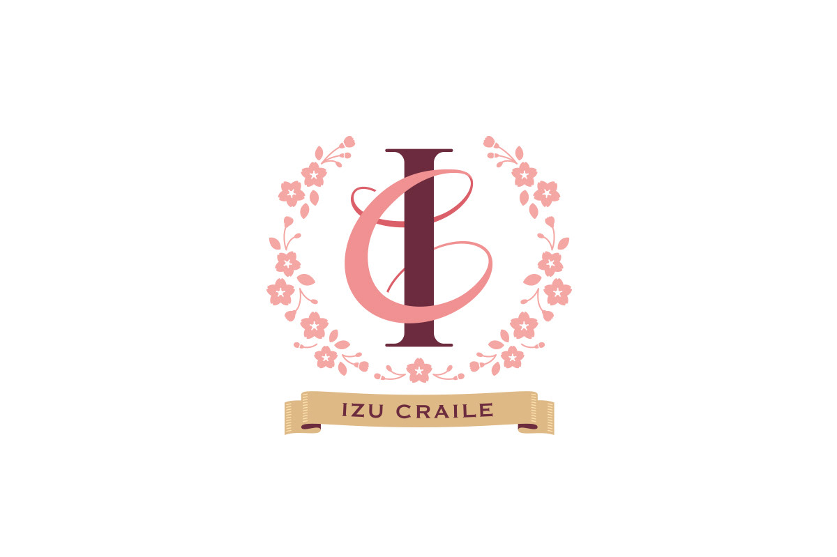
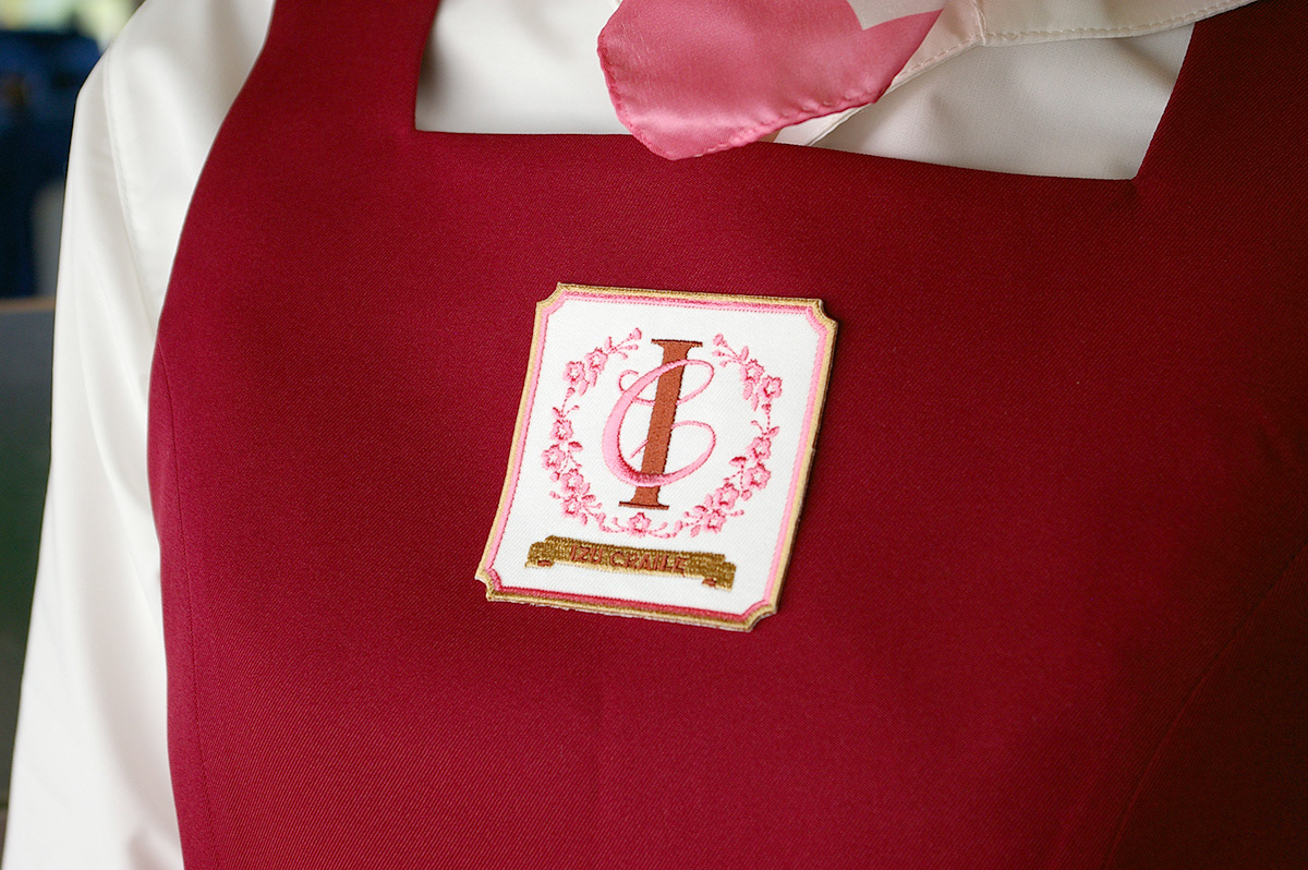
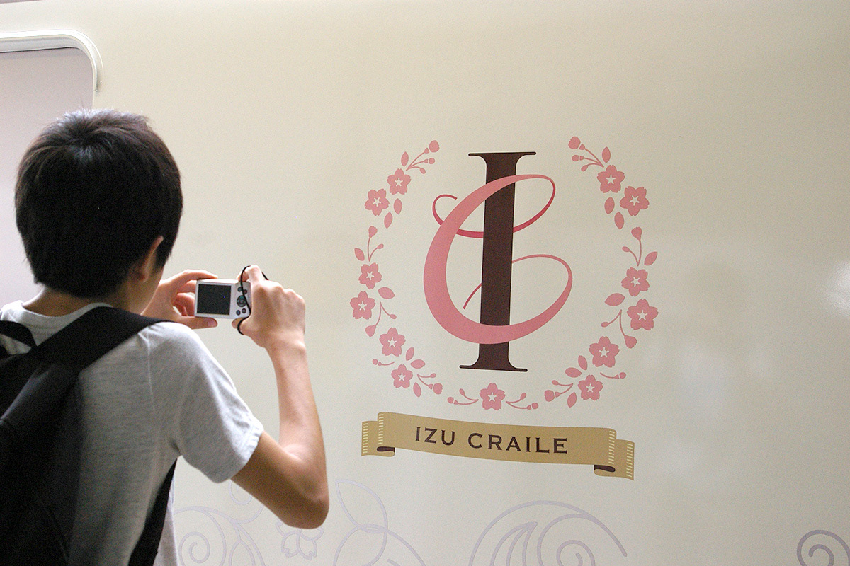
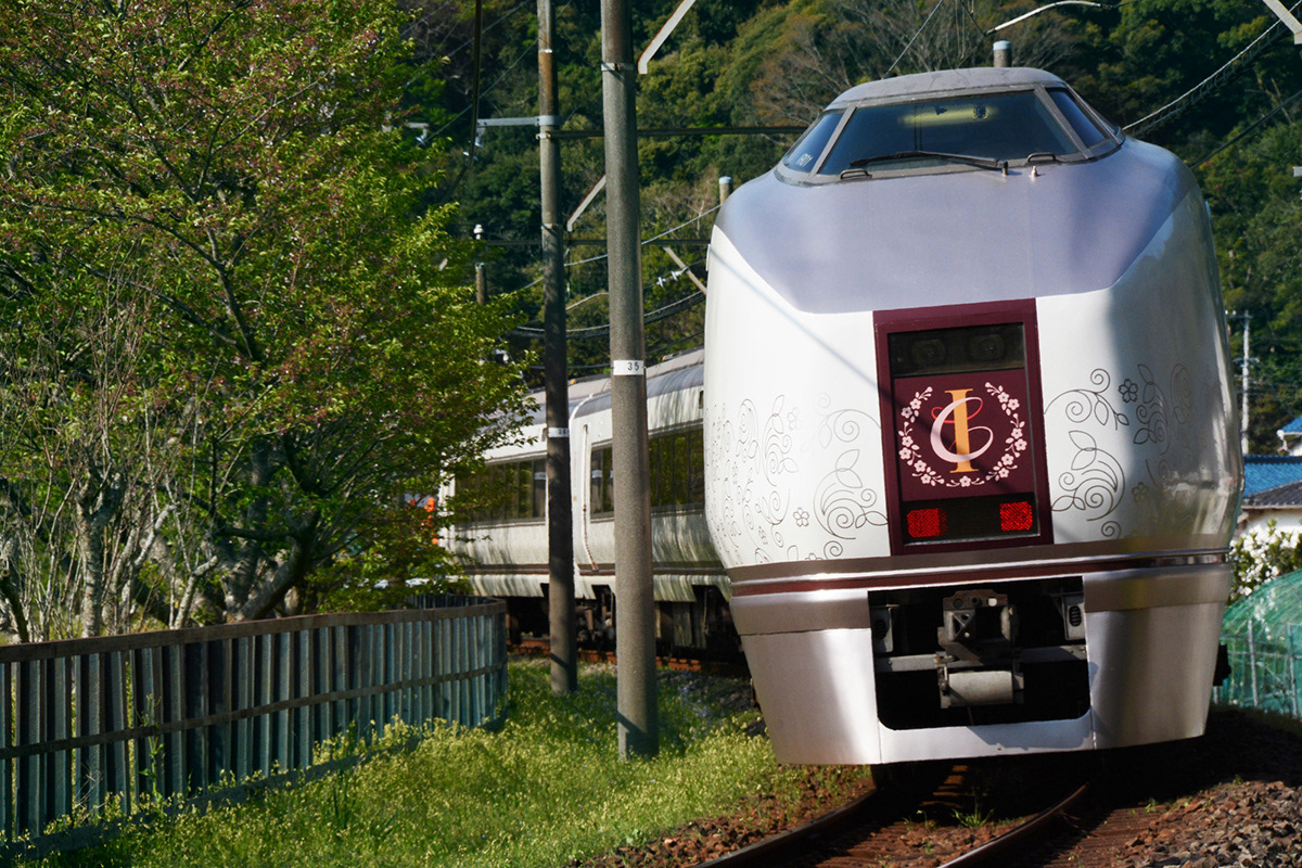
A special sightseeing train running between Odawara, a castle town an hour from central Tokyo, and Shimoda, a seaside resort located in the southern part of the Izu Peninsula. On the train one can enjoy food and nice chats while enjoying the scenery of Izu. It offers a high-end travel experience, targeting especially women. The logo represents the “C” in “Craile”, and it entwines the letter “I”, blown by the breeze of Izu. The Kawazu cherry blossoms are scattered around the logo, and the pattern is used in the cars for the table mat, menu, bags, wrapping, etc.
Client: East Japan Railway Company Yokohama Branch
Planning / Direction: EAST JAPAN MARKETING & COMMUNICATIONS, INC.
Producer: Entertainment Bowl Co., Ltd.
Exterior Designer: Soil
Designer: Shunpei Yokoyama
Copy Writer: Hidekazu Kobayashi
Planning / Direction: EAST JAPAN MARKETING & COMMUNICATIONS, INC.
Producer: Entertainment Bowl Co., Ltd.
Exterior Designer: Soil
Designer: Shunpei Yokoyama
Copy Writer: Hidekazu Kobayashi
—
JR「伊豆クレイル」
都心から1時間ほどの城下町・小田原から、伊豆半島の南に位置する海辺のリゾート・下田まで、伊豆の景色を眺めながら「食」と「会話」を楽しむ、女性をターゲットに上質な大人旅を提供するリゾート列車。シンボルマークは頭文字「I」に「クレイル」の「C」が、伊豆の風に吹かれて巻きつく姿。周囲に散りばめた河津桜をパターン化し、メニューやランチョンマットなど様々な車内ツールに展開している。
クライアント: 東日本旅客鉄道株式会社 横浜支社
企画・ディレクター:ジェイアール東日本企画
プロデューサー:株式会社エンターテイメントボウル
設計(列車):株式会社soil
デザイナー:横山俊平
コピーライター:株式会社コバヤシヒデカズ事務所
企画・ディレクター:ジェイアール東日本企画
プロデューサー:株式会社エンターテイメントボウル
設計(列車):株式会社soil
デザイナー:横山俊平
コピーライター:株式会社コバヤシヒデカズ事務所