2020
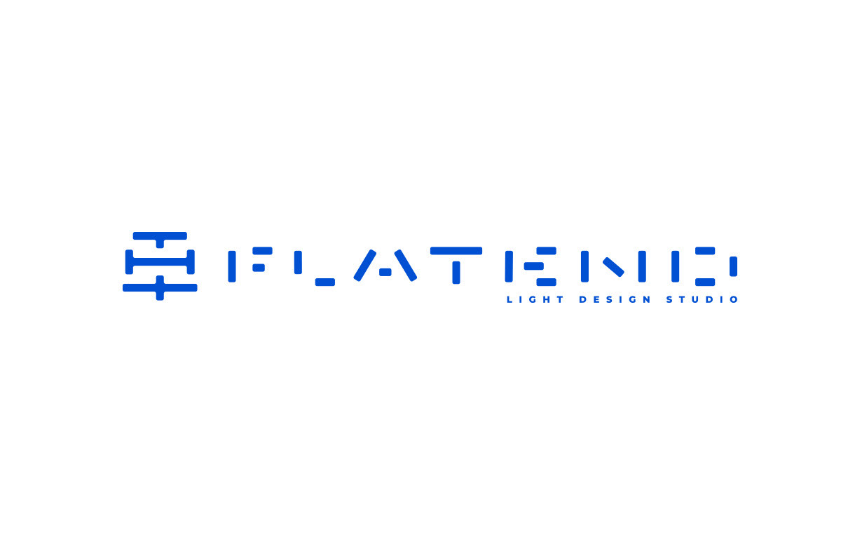
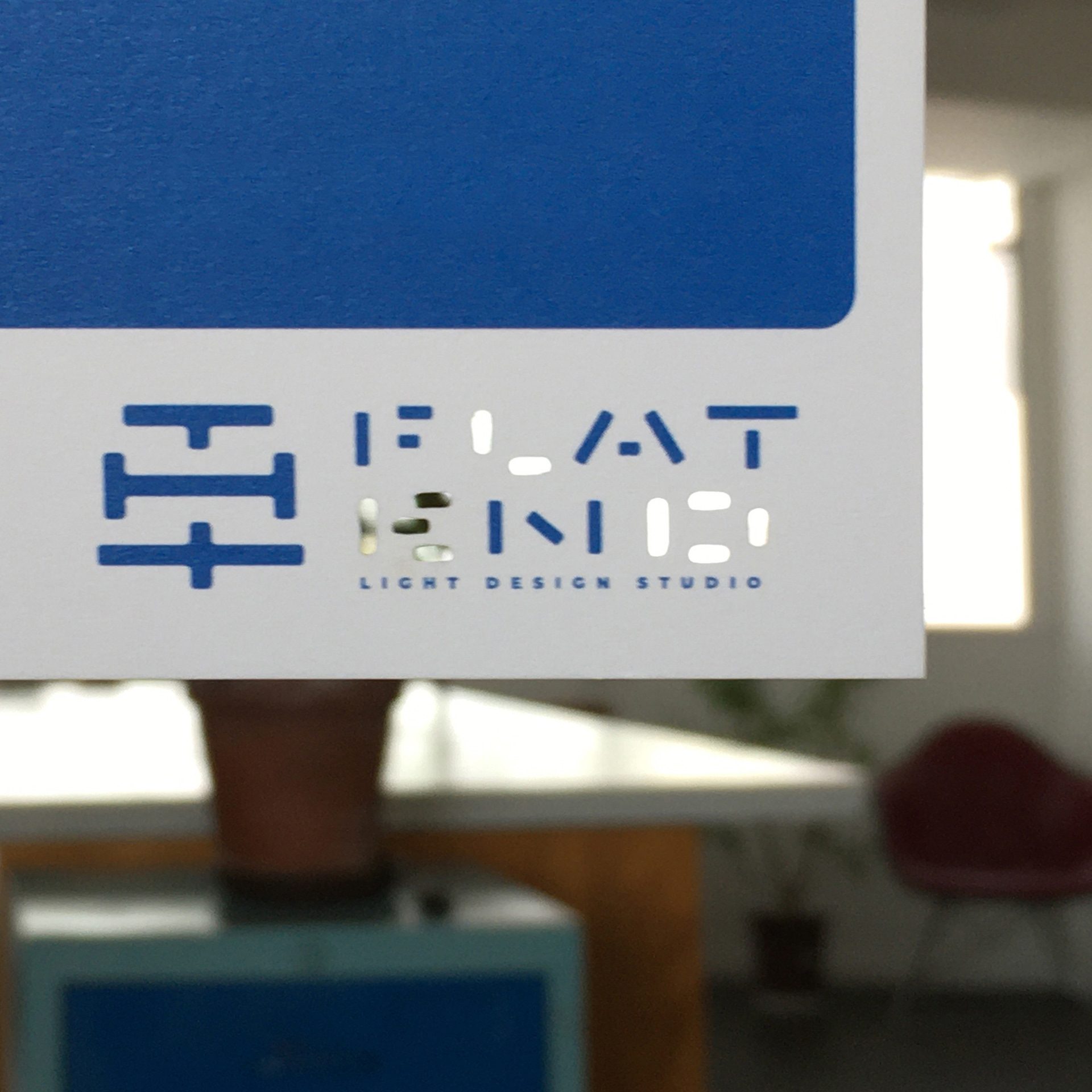
FLATEND
Logos, Corporate Identity
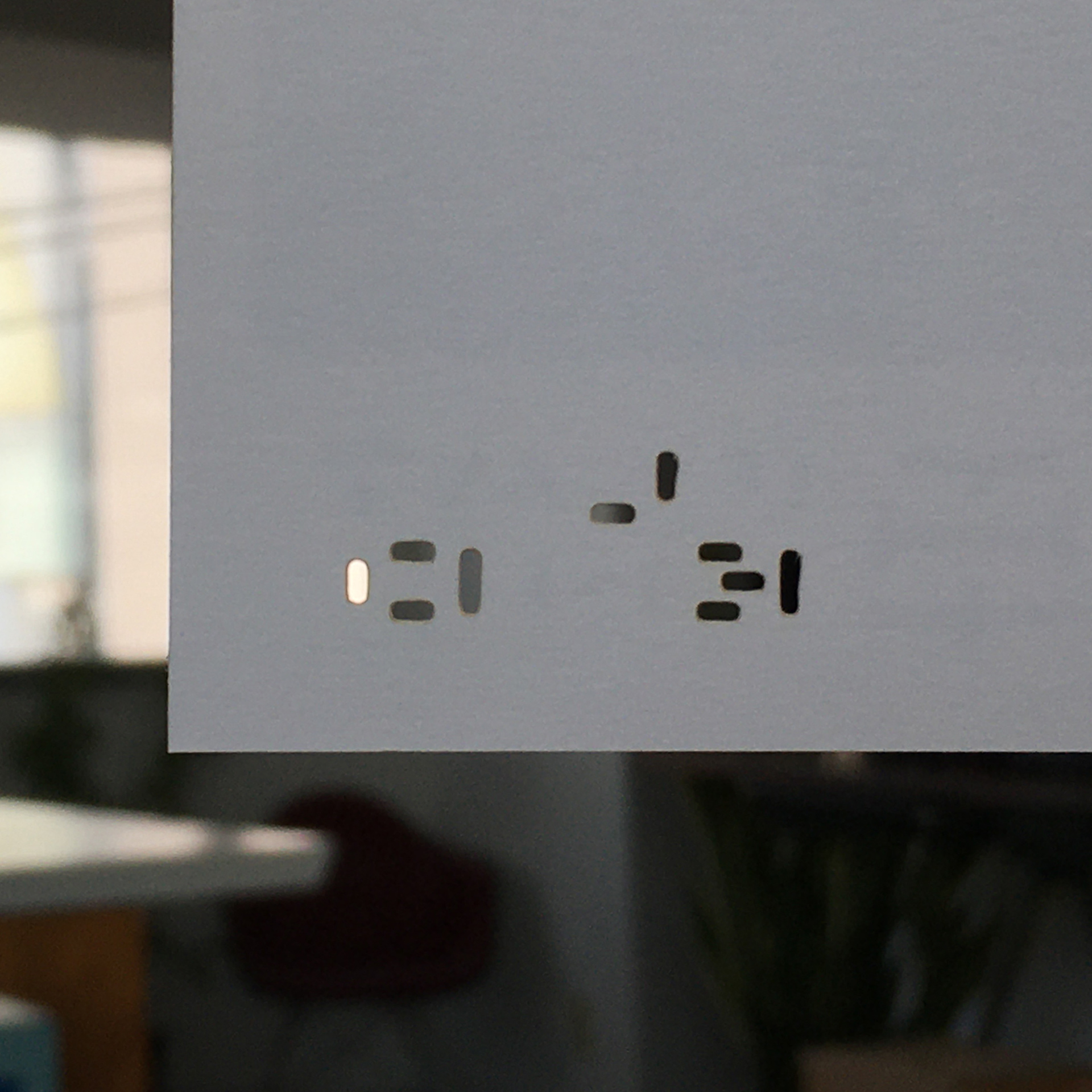
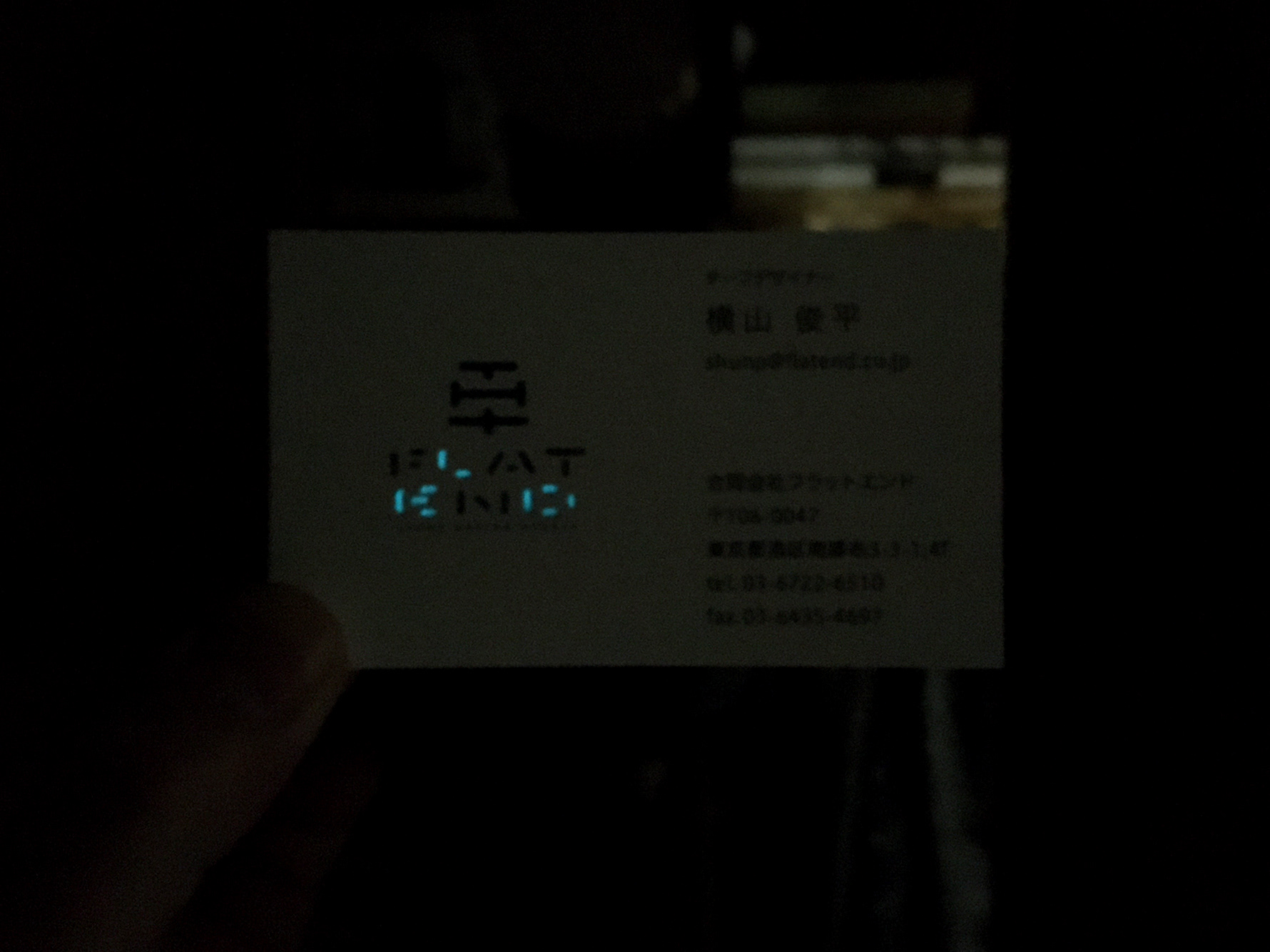
A lighting design company with a strength in LED display. The logo, a combination of the kanji “hira", meaning “flat”, and the letter, “H”, from the name of the company representative, “Hirao”, shows the flat relationship between “Wa”, Japanese style, and the occident. The typeface is a form reminiscent of blinking and flashing light, and the theme color is “flat-end blue”, inspired by the “blue Light Emitting Diode”, that enabled color expression by LEDs. These elements portray their devotion to the pursuit of the next style of expression in illumination. The business card only uses the letters, “L” “E” “D”, extracting only them from their place in the company’s otherwise whole name, and printed with a phosphorescent blue, as if emitted by an LED light.
Client: FLATEND LLC
Art Director / Designer: Shunpei Yokoyama
Art Director / Designer: Shunpei Yokoyama
—
LEDをベースとした照明デザイン会社のシンボル。代表の氏名より漢字「平」とアルファベット「H」を組み上げたマークは、「和」と「洋」のフラットな関係を示している。書体は点滅・フラッシュしている光を想起させるフォルム、そしてLEDのカラー表現を可能にした「青色発光ダイオード」より フラットエンドブルーをテーマカラーとした。それらはイルミーネーションの新しい表現を追求する姿勢を表わしている。社名アルファベットから「L」「E」「D」だけを蓄光印刷した名刺はブルーの光りを放っている。
クライアント: 合同会社フラットエンド
アートディレクター、デザイナー:横山俊平
アートディレクター、デザイナー:横山俊平