
2022
T&C HITECH KOREA Co.,LTD
Logos, Corporate Identity
A trading company that connects Japan and South Korea.
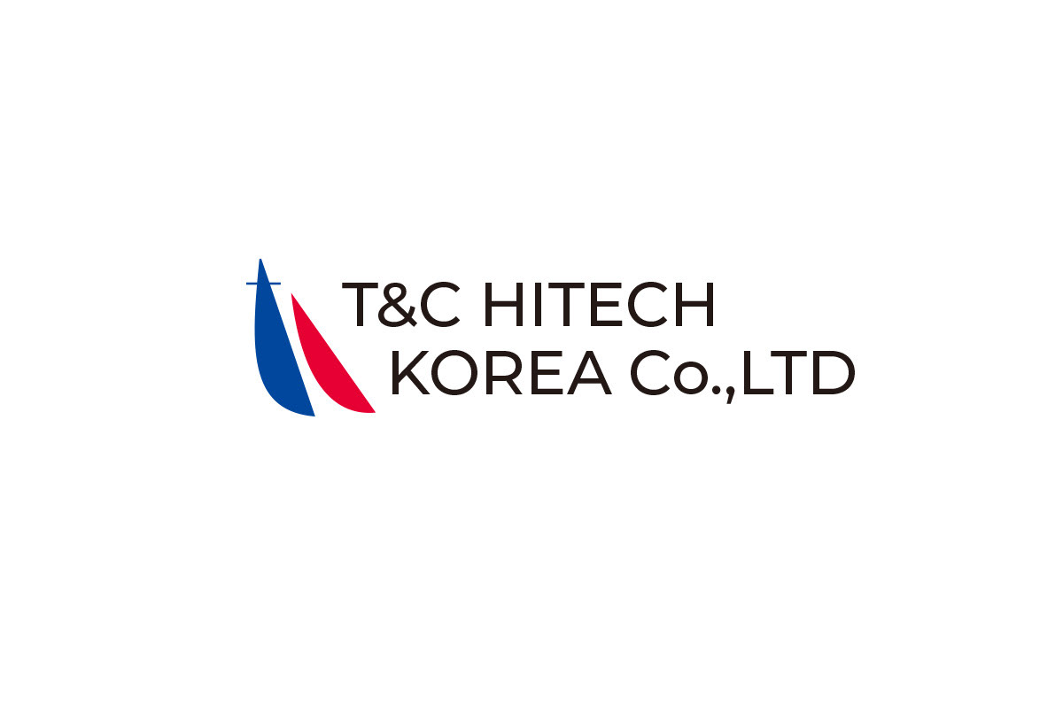
For the company logo, I chose a yachting motif, which the director is passionate about. The symbol mark, which looks like two sails, or perhaps even two ships, also incorporates the "T" and "C" in combination from the company name.
The yacht, which is caught in the wind and tilts at speed from the taut sails, represents the attitude of the company as it freely travels around the world.
The logo also contains the message that Japan and South Korea will cooperate, compete, and flourish together.
Client: T&C HITECH KOREA Co.,LTD
Art Director / Designer: Shunpei Yokoyama
Art Director / Designer: Shunpei Yokoyama
—
日本と韓国を結ぶ貿易商社。社名の「T」と「C」を組み合わせ、オーナーが大好きなヨットをモチーフにしたシンボルマーク。風をはらんでスピードに乗って傾く船は、世界を自由に走りまわる会社の姿勢を表している。 2枚の帆(もしくは2艘の船)は、日本と韓国が協力し、競い合い、お互いを高めてゆくメッセージも含んでいる。
クライアント: T&C HITECH KOREA Co.,LTD
アートディレクター、デザイナー:横山俊平
アートディレクター、デザイナー:横山俊平